La Biennale di Venezia Magazine
Data Visualization
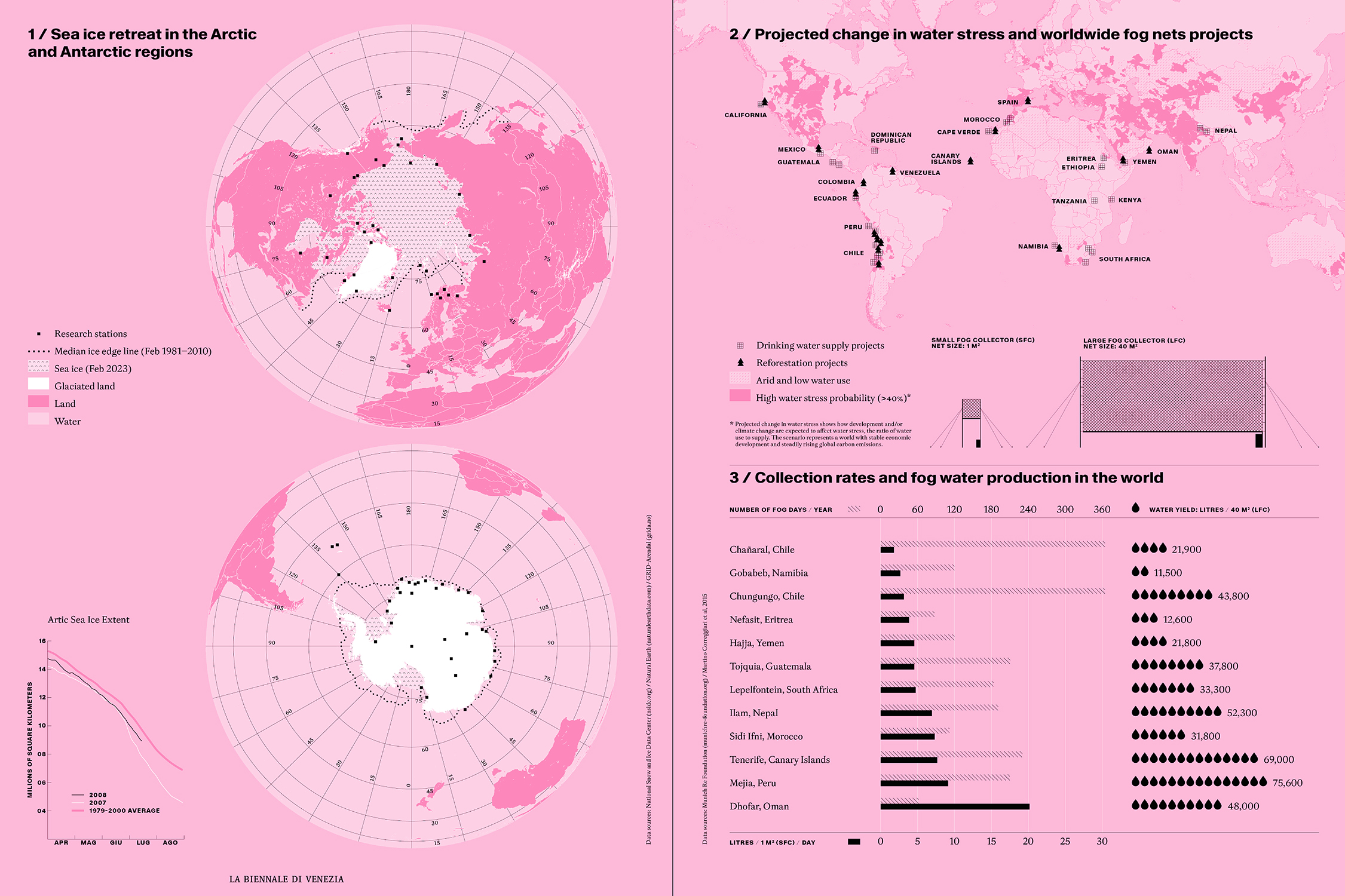
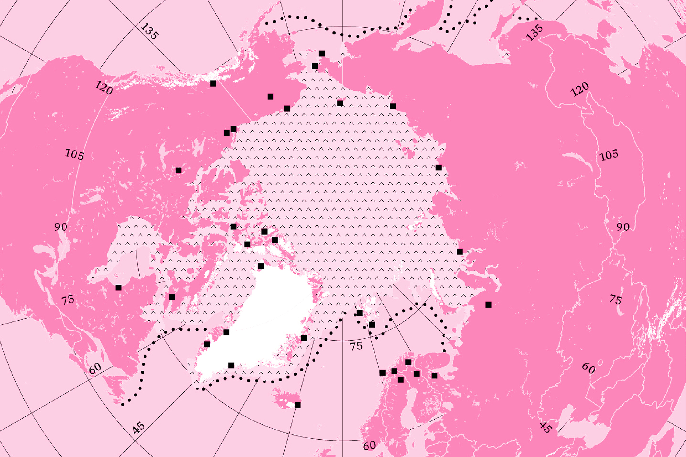
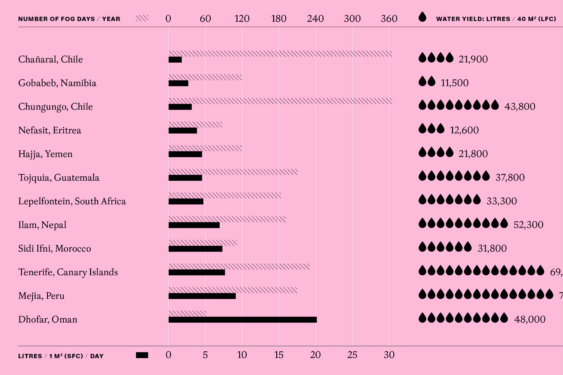
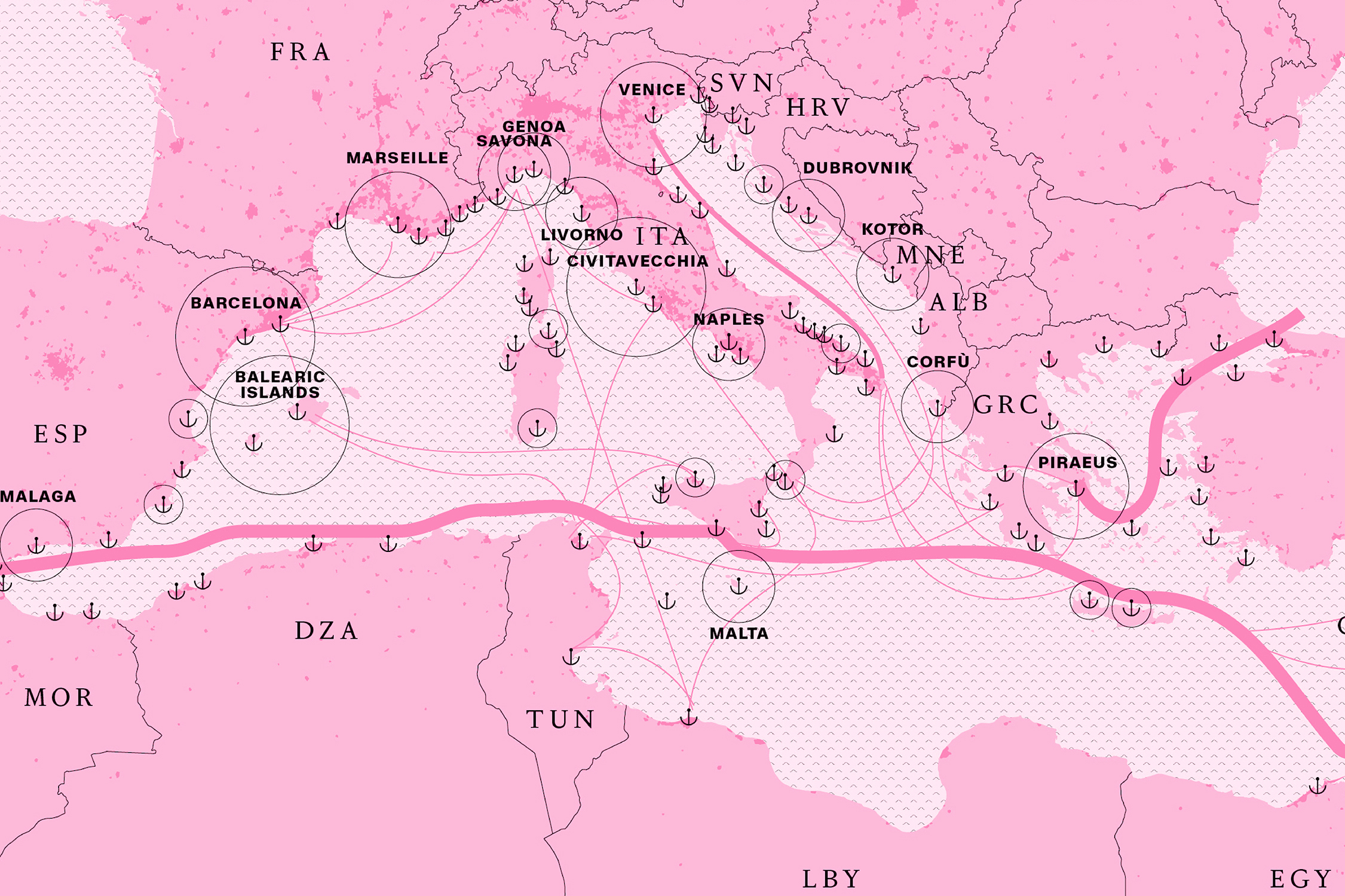
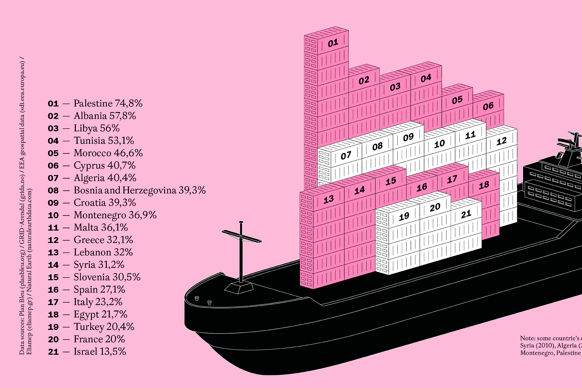
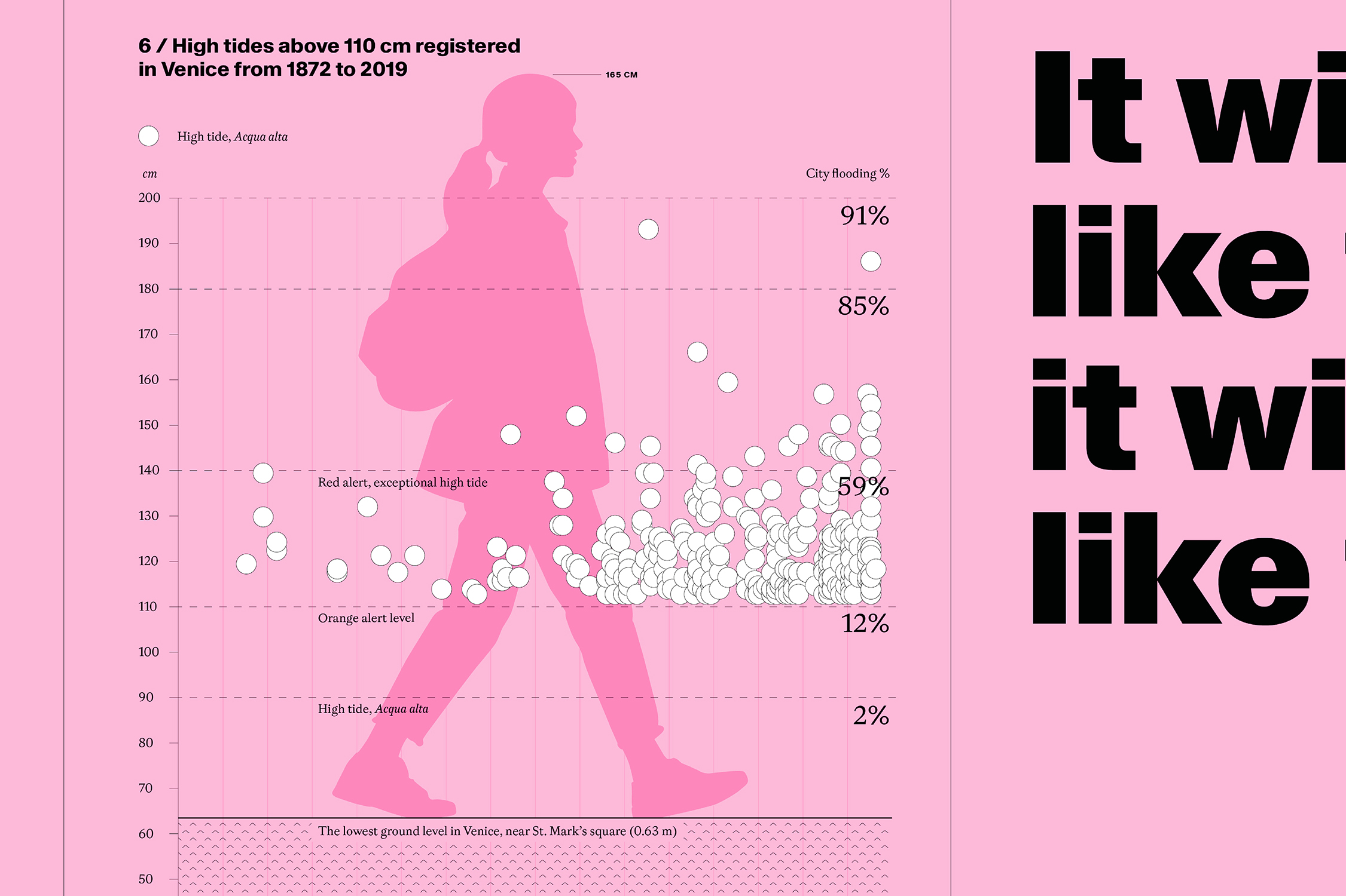
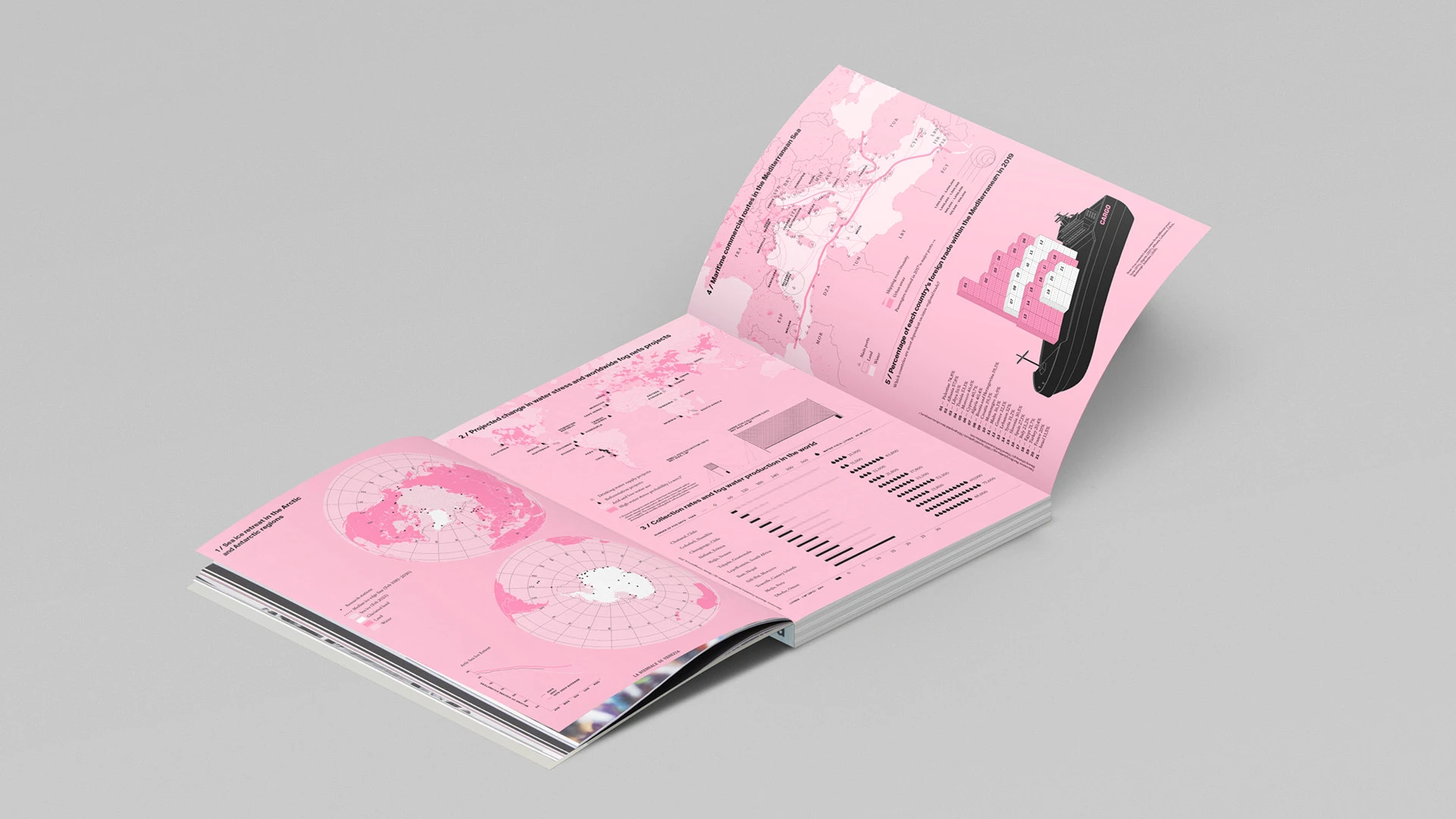
In the first issue of the renewed Biennale di Venezia magazine, data visualization plays a significant role in shaping the visual and conceptual narrative of the publication. Through four original infographics, the project explores environmental, climatic, and geopolitical phenomena, offering readers visual tools to understand complex dynamics. The map of the polar ice caps uses a double orthographic projection to overcome the limitations of conventional cartographic representations, highlighting the dramatic reduction of the ice sheets and the structural difference between the Arctic and Antarctica. The infographic on exceptional tides in Venice visualizes the acceleration of high tide events in relation to their impact levels on the city. Fog nets are illustrated through maps and charts that link climate, water availability, and local innovation, while Mediterranean trade is mapped through a multilayered graphic that compares shipping routes, cruise traffic, and economic dependencies among coastal nations. Each visualization is accompanied by a project text that explains the cartographic, graphic, and narrative choices behind it.